Nang Magazine Double Page Spread Analysis
1) How does the choice of band featured in the article suggest who the target audience will be?
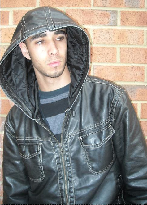
The artist featured in this article suggests that the target audience will be teenagers aged at around 16+ who have a taste for UK Hip Hop and RnB. The images featured in this article immediately suggest this because of the way the artist is posing, for example in the central image the artist, JMC looks quite cocky also the clothes he is wearing make him look quite sharp and can suggest to a younger audience from this background that this is the way to live. Also one of the smaller images in this article feature the artist with two very well known individuals representing the UK Hip Hop scene
2) What type of language is used in the article? Give examples of words or phrases which are specific to the style of the magazine
The language used in this article is surprisingly quite formal for a hip hop orientated magazine. I believe formal language has been used more than slang in this article so that the magazine can appeal to a much wider audience also I think this style of language has been used so it does not alienate the magazines readership
Examples of language used “the hackney rapper told Nang’s Soonabar Patel how suffering a near fatal stabbing has become his driving force for success”, “entitled safe cracker, the interludes borrow audio from universals inside man”
3) How is colour used?
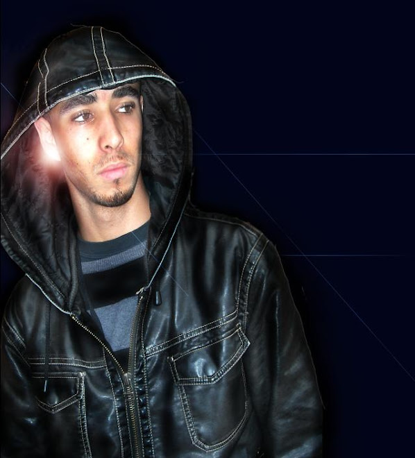
The colours used in this article are very interesting because of their simplicity. The magazine has stuck to two basic colours black and white which may sound dull and boring however the black background makes the white text stand out and blends in with the black and white image. Also as the article talks about the ghetto area of Dalston, Hackney and the regular crime and violence occurrences I believe the use of black supports this kind of this depressing theme. Also the use of white text on a black background seems to catch the reader’s eye immediately and draws them in to read the article.
4) What style of text is used? Is it similar to any other pages? What does it say about the image of the magazine and the audience?
In this article the text used is quite interesting because we see the anchorage text in large bold font with a scratched ghetto kind of style; I believe this has been used to support the theme of the actual article. As we look below the anchorage text we see a summary of what the article is about in smaller but bold font I believe this has been used so that the audience can see what the article is about before they read straight into a large article. However the main body text is very plain and dull so it is easier for the audience to read and possibly to appeal to a wider audience as well. Also if we look through the rest of the magazine we can see that a lot of the main body text in other articles is quite similar which can create a house style for the audience.
5) How is the double page spread laid out? How much of the pages are taken up by images and how much by text? How does this reflect the audience? What do they value?
From examining the article we can obviously see that the central image literally consumes a whole page, also even where the main body text is situated there are smaller images under it, I believe that 60% of the page is used for images in this article which can reflect on the audience because it looks like from this article that they value images more than large text articles, I believe this is typical for a young audience and the magazine sees this to so I think a house style of more images than text is present within the magazine.
6) What tone is the magazine using when addressing the reader (as a close friend, a member of an 'in' crowd or an informed intelligent fan?) - provide evidence
In this article the magazine is using a surprisingly formal kind of tone with its audience for a youth orientated magazine. I believe this is so that maybe an older audience will be able to just read this without any confusion of slang /colloquialisms. The use of formal language makes the magazine look more professional and makes it easier to read. The formal language adds to the magazines professionalism because the magazine is written by students and the use of formal language kind of breaks a stereo-type for young people and gives the magazine credibility.
7) How is the artist/band presented to the audience through the images? You may wish to carry out a textual analysis.
The artist featured in this magazine is presented to the audience through the images on the double page spread as a someone who looks quite successful in what he does, he also looks quite cocky and flash, we can see this through his attire/clothes in the central image and through his body language in some of the poses made in the photos. Also through his clothing we can see what kind of background the artist is from and what type of music he makes, for example in one of the images the artist JMC is wearing a fitted cap and graffiti styled hoody this shows me that he is from a street kind of background and that he is more than likely involved with the Hip Hop scene. Also we can see what genre of music JMC is involved in through one of his images where he is featured with two very successful innovators in the Hip Hop scene, Remy Ma and Tim Westwood. This can show the audience that if he is featured with such people it can give away the idea of what genre he is more involved in.
8) How does the style of the article match the style of the front cover?
In comparison with the front cover of Nang and the double page spread we can see that more images than text are used on both the cover and the double page spread which can of course create a house style for the magazine, however in my personal opinion I think that the cover and the double page spread barely matches at all and does not look like there from the same magazine, I think this because of the use of dark colours on the double page spread is completely the opposite from the lively and bright colours used on the front cover. Also the use of military style text does not match the graffiti style and shades of the front cover, this makes the double page spread very ineffective in terms of keeping the same style though out the magazine.
9) Does the article demand any prior knowledge? Give examples.
I believe this article does not require any prior knowledge about the artist because the magazine is interviewing the artist in a way that any type of audience can pick up the magazine and read about the artist mentioned, for example the magazine gives a brief introduction to the artist’s history “growing up in east London’s Dalston, in hackney life was not easy for JMC”. The magazine also gives a brief review for the audience on JMC’S current album.
Subscribe to:
Post Comments (Atom)

No comments:
Post a Comment