Friday 1 May 2009

Evaluation layout


My Final Music Magazine Evaluation

Before Creating my magazine, I firstly had to understand how covers and other pages are constructed i.e. title positioning, how the central images have been edited. I looked at and analysed a range of magazines, this helped me because it helped me understand the rules, conventions and principle standards of current music magazines. For example I noticed that on all magazines the central image usually gives out a provocative statement to the target audience which attracts them to pick it up and eventually buy it, also I noticed how the title is always positioned at the top of the page and how it uses bold and sometimes eye pleasing colours to again attract the audience and another convention I noticed heavily whilst researching these magazines was how the anchorage text is predominantly positioned on the left hand side of the page because of the simple reason that people read from left to right. On my magazine I have incorporated all of these conventions and I particularly learnt these conventions from such magazines like RWD, Vibe, MixMag and Nang! Magazine, I chose these magazines as I wanted my magazine to be based around current underground music for example hip hop, rnb and new rave. However Nang Magazine is not a music magazine, it is more a teenage news and gossip magazine, and I chose this magazine because I wanted to understand how the magazine attracts the attention of young people aged between 15 and 18 because this was the age group I was going to use as my target audience.

Here is a comparison of my draft magazine cover and an edition of vibe magazines front cover, as you can see the anchorage text on my magazine is roughly positioned in the same position as Vibe Magazines, also how both central images are edited in roughly the same way for example both central images have a very simple and plain background, also how the puffs are positioned right under the anchorage text.

Here is a comparison of my final front cover and MixMag’s front cover, again as you can see the anchorage text is positioned on the left of the magazine, another thing that is similar is the use of two people in the central image which give this image some sort of provocative message to the audience in their own ways, also I decided to move the puffs to the right hand side of the magazine because I though the audience will read from left to right and once they have finished reading the anchorage text the eyes will continue to move in this motion and they will continue to read on.

Although I learnt a lot from analysing other existing magazines I then needed to give my magazine a certain edge to make it my own instead of a clone of existing magazines, by experimenting with Photoshop I managed to create my own unique style. For example if you look at the some of the text on both of my magazines you will notice that there is a consistent glow behind and around the text, also by playing with the type faces I managed to create a very unique font. If you pay attention to the font style on both my magazines you will notice that there is always a different outline colour, particularly the opposite colour of the actual font to attract the attention of the audience


Here is an example of how I made the font on my magazine look unique.

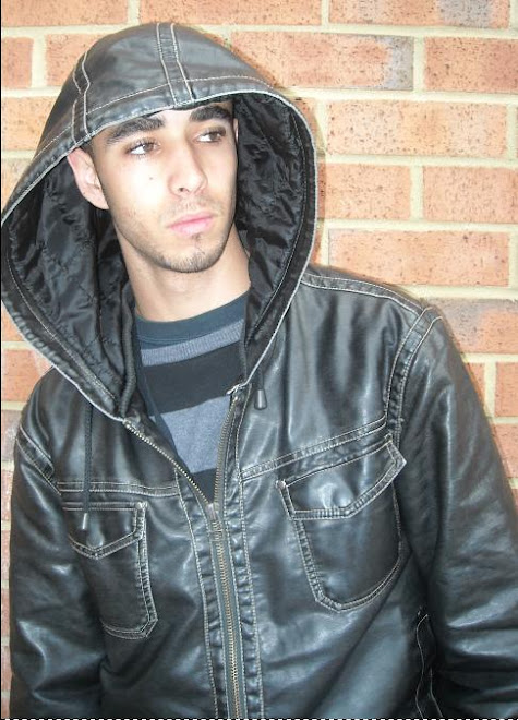
My music magazine represents quite a narrow range of social groups, I thought during my planning process that I would concentrate predominantly on an audience aged at around 16-20 that are interested in the music genres of Hip Hop, RnB and UK underground. The target audience that would read my magazine would be described as quite stylish, young and into street boy culture perhaps. I have represented these social groups in the way that the magazine looks quite cutting edge and quite dangerous, for example the anchorage text on my final front cover “ DK Productions and Depraved Soul: Its War” I believe the use of this anchorage text incorporates an element of danger and perhaps aggression, although that his magazine does not endorse any type of physical aggression which is ever growing amongst the age group I am targeting some may say that such anchorage texts and puffs that I have used in both my magazines do in fact endorse these conventions, for example “ DK Productions and Depraved Soul: Its War” and “DJ Virus: the Life of a Hustler” “ and “Lil Wayne still kicks ass”. On a more positive note I think that I have represented these social groups through the use of my images, for example if we look at my first draft of my front cover we can see that I took the central image using a mid long shot which originally was shot in front of a brick wall with faint graffiti on it, I believe that this was effective because I think some of my target audience may be used to seeing things like this in certain areas however I edited this and made the background a plain colour because I believe that the image was giving into negative stereo types made about young people, also if we look at the Mise-en scene of this image we notice that the person in the photo is wearing a baggy and very glossy jacket with his hood on, this costume is effective because it represents the current styles of young people of a street kind of culture. As mentioned before, the setting of the central image was in front of a brick wall with faint graffiti on it, although it did not get used I think the setting did represent my target audience although it was a negative representation. To your right is the original central image that I would have used.

I believe that my final front cover however, represents these social groups much better for example the central image is very provocative because of the way it is framed in terms of camera shots, I used a two shot of these two people back to back to support my anchorage text which featured war, I think this shot supports my anchorage text because it looks like there is some sort of rivalry and animosity between these two characters. Also in terms of Mise-en scene I thing that this image is again very effective in the representations of this social group, the first reason is the way that they are both dressed, I think that both characters look quite smart with one wearing a leather jacket and the other one wearing a black military styled jacket, with that in mind I also believe that they look quite thuggish aswell, almost like a cooperate thug. The setting of this photo is quite similar to the draft central image however this photo does not incorporate the graffiti in the background connoting negative stereo types.

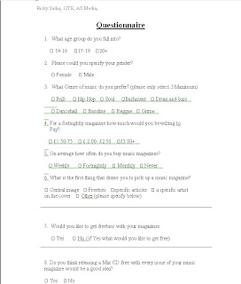
To choose my target audience I firstly handed out a questionnaire asking in particular what age the recipients were, would genre of music they were into, whether they regularly bought music magazines and what other magazines they read. On the basis of my result for this questionnaire I was able to build a mental picture of what they would be, my target audience will be aged at around 16-20 more than likely to be students which affects the price of the magazine, they will be interested in Hip Hop, RnB and other underground forms of music. I also learnt that the location of the audience may affect the styles of music that they are involved in, that is why I my magazine is based around US and UK underground styles and people that follow these styles. I believe my target audience will be from very main stream areas such as London and other urban built up cities because I think that these people would be more interested in reading about the artists and articles featured in this magazine.

Once I had chose my target audience I had to somehow come up with a range of ideas on how to attract their attention or address this audience as effectively as I could. I thought that the more obvious way to do this was through language, for example one of the puffs says “Free demo CD of the hottest tracks on the block” I believe that the use of informal language and colloquialisms allowed me to engage into the street boy kind of culture another example of this is used in another puff “Lil Wayne still kicks ass” . Also the age group that I am trying to attract, 16-20 year olds I think would be very interested in freebies so that they get more for their money when purchasing magazines so I used freebies in my magazine to attract their attention, e.g. “Free demo CD of the hottest tracks on the block”. Whilst analysing other music magazines I noticed that they use a lot of big star’s names as puffs, and I also noticed that they are in fact quite effective, so on my magazine I thought of using big names that are involved in the type of scene and stardom that my target audience are interested in, for example I mentioned of the biggest names in the hip hop world currently in my magazine, Lil Wayne. I used this name because from my own experiences with this type of genre Lil Wayne’s name is very universal and seems to stand out wherever it is used amongst the hip hop and rnb fans. Another convention used in attracting my target audience was the slogan of the magazine, “The Urban Overload” . I think this was effective because my target audience will have a very urban style about them and it may lead them to believe that this magazine reflects their style and possible personalities. Also in terms of the age group my target audience will be, it is more than likely they may be still involved in education, if this is the case the question of budgeting themselves when buying magazines may be a problem, so to make this magazine more appealing in terms of price I set a very low price and placed it on the page in a two set coloured star so that it would attract plenty of attention. As mentioned before the use of big stars used on the front cover was very effective because whilst in my research process I found out that in my questionnaire what my audience would like to read about which included celebrity interviews and film and music reviews

The Media institution I think would be the most suitable to distribute and advertise my magazine would be IPC Media because of the amount of very popular and successful magazines they have distributed over the years, such magazines include Nuts, Loaded and the TV Times. I think that this media institution would be suitable because of the sheer volume of audiences they advertise and distribute their magazines to. I also think that media institution could help advertise my magazine because they may already have other platforms for example TV channels radio stations, websites ECT. I think that Kiss 100 would be another suitable media institution for advertising purposes because they heavily endorse the Hip Hop and RnB genres through the digital TV Channel, Their world famous radio station and their impressive website, and distributing my magazine through their platforms would benefit my magazine and their own business as they currently do not have a magazine.

Through out this project I have been introduced to many different conventions and variations whilst creating my magazine. To create my magazine I had to use a program called Adobe Photoshop, over the time I have developed several skills which enabled me to create my magazine. Such skills are the ability to edit the lighting of a photo, the ability to apply several images onto one layered background, the ability to edit font styles including adding different colours and lighting effects and how to replace colours on images. Another technological skill I have developed was creating a blog, I created my blog on Blogspot.com and upon creating the blog I have learnt how to upload various types of work e.g images videos and text based responses, I have also learnt how to create polls which allowed me to get feedback on my work from other blog users in my college network .Aswell as developing my technological skills I have also learnt how to critically analyse magazines and images to a point where I had a valid insight into the how the magazine industry works ie time/cost/effort, this involves finding the right artists and making an article for them, the photo shoots, choosing the location of the photo shoot and choosing what goes into the magazine itself.

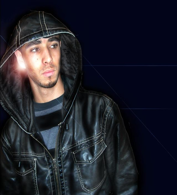
Above is a comparison to an image which I used for my contents page and how I edited this photo to make it look more effective and match the colour scheme of my contents page. I edited the image by removing the brick wall background and turning the brown leather jacket to black leather, I also added a glow on the characters ear to give the illusion he is wearing a very shiny earring which is hitting off the sunlight. to make him look more gruff and thuggish I darkened his beard so he does not look so young and innocent.

From comparing my preliminary task to my final cover, contents and double page spread, I think I have learned a great deal on how music magazines are constructed. When I created my preliminary magazine cover I did not have the knowledge of how camera shots affected my work and how they can show different things to my audience or how location affected the representations of the photo, I have also learnt from my preliminary task that the front cover should stand out amongst all other magazines and that maintaining the audiences’ attention is very important i.e. the use of puffs and buzz words. When I created my preliminary contents page I was not aware of how contents pages in magazines were constructed i.e. the layout of the page, where to position images and logos, but by analysing other magazines I began to realise how this was done and I have benefited heavily from this which reflects in my work. I have also learnt from my preliminary double page spread how language can affect the audiences’ attention, for example in my final double page spread I have an interview where I do use some very informal language including colloquialisms and swear words. I believe that this is effective because to it enables me to engage with my audience and let them know that this magazine is for them and will encourage them to buy it in the near future over a magazine that does not even represent them.


Tuesday 31 March 2009

Double Page Spread Interview Draft

This week hype talk speaks to two of the most controversial hip hop and alternative producers in east London, Depraved Soul (Deps) and D.K Productions, as they go head to head to see who really the urban king is. Hype Talk interviewer Ricky Sadiq takes a closer look in to the current rivalry of these two phenomenal producers.

Ricky: Once again I just want to say thanks for doing this interview .So as we all know you two are currently the most wanted and talked producers around in the UK hip hop scene, but how did it all begin for you?

Deps: well Ive been making music since I was about 13 when I started learning how to dj in my local youth club, and then later learned how to play the keyboard, when I was about 16 I bought my first producing software and mixed virtually every song I had on my computer until I had the confidence to start using the studio in my school and started recording instrumentals for kids who could mc and rap in school, when I was about 17 I Recorded an instrumental called screw face which got sent I sent to a friend of mine who was a very talented young dj which he then played on air and after that things stared moving alot faster as I was getting phone calls and emails from various upcoming groups and artists who wanted me to produce a song for them, from then on I progressed onto bigger artists such as Kano and glimmerz

D.K: well for me Ricky for as long as have known I have had a passion for music and creating music, I started playing the piano from a young age and started Producing when I was about 16, but I never used to make hip hop instrumentals, I was more intrigued by slow rnb instrumentals, only till later when my taste expanded I began to experiment with hip hop style beats, then once I started to deliver hip hop beats word got around, and I had a phone call from baby bash, saying that he was looking to make a return to the music scene and if I could produce an instrumental for him to sing on, so obviously I jumped at the chance and gave him my first main stream beat, the track was called “cyclone” and was featured on channel U and choice fm, after the release I was signed to motivation music.

Ricky: right so you two are obviously well acquainted but just tell us, how did you meet? Because I know you are both from different areas of London.

Deps: (looks at D.K) umm we met at the Katt Williams tour in Birmingham where our managers got talking and asked us both if we could collaborate with Ron Brownz and at the time I was experimental stage and I thought why not, so as everything went ahead myself, D.K and Ron all got really acquainted and we have all been quite close

D.K: yeah, as Deps said we were both at an experimental stage and were looking to enhance in music again and from then on we’ve all stayed as tight boys.

Ricky: okay so we all know D.K is signed to Motivation Music and Deps has just recently been signed to Krystal Klash Recordings, and these two record labels have had on going rivalries for years, would that make you two rivals?

D.K: umm well if you say it like that (laughs) no im joking but in a musical sense of mind of course he is my rival, like I mean the music industry is a very competitive scene and I’m in it to win it, but in a sense that Deps is my boy I would not say we are rivals to an extent where violence and diss tracks are to be created.

Deps: yeah D.K is speaking the truth because no matter what we are both individuals in the same game going for the same prize and we always will be musical rivals but yeah with that aside D.K knows I got his back, but I don’t think there anything wrong with a bit of friendly competition.

Ricky: okay right, the big question that everyone is asking is what is your collaboration album about?

Deps: well I wouldn’t say it’s a collaboration album as such, because basically the album is going to consist of 10 tracks my self and D.K will produce 5 tracks each featuring various different artists and basically go head 2 head and let our fans find out who really is the best.

Ricky: shitt! That sounds hot but seriously you’ve got to tell us who will these artists be?

D.K: umm I can’t say all of them because they haven’t all be confirmed but from me you can be expecting chipmunk, the crazy cousins, gigz, N- Dubz, faith SFX and Frisco, and im expecting more artists to just confirm everything.

Deps: (laughs) unlike D.K all my artists have been confirmed so you’re in for a real treat today Ricky. The artists you can expect me to be working with will be Flirta D, J Holiday, DJ Semtex, Jagged Edge, Donaeo and Jay Sean.

Ricky: right we can all see you’ve came from virtually nothing to working very high profile stars so is there any advice you’d give to young people all around London all who are trying to break through into the music scene? Because your stories may motivate a lot of unknown producers and DJ’s to up their game.

Deps: Basically just keep doing what your doing, with music everyday is a chance to learn something new and not everyone has a talent in music so just don’t waste what you’ve got and keep pushing yourself further…if it don’t kill you it only makes you stronger.

D.K: yeah like Deps said keep a pushing yourself to the limit and don’t be afraid to take tips and try learn new things, one thing I would say myself personally is be experimental, experiment with your ideas and don’t get stuck onto one genre. Be diverse, diversity is the key to breaking into this kind of business.

Ricky: Deps, D.K it’s been real. Thanks for doing this interview, your answers have been fantastic and im sure this will get a lot of readers talking.

Deps: it’s been a pleasure man; glad to have answered your questions and im sure D.K feels the same

D.K: yeah man definitely

Ricky: Don’t forget readers next week I will be interviewing your number one Dj, Dj ironic.

Thursday 22 January 2009

Final Contents Page


Above is my final draft for my contents page.

Tuesday 20 January 2009

First Draft Contents Page


Above is the draft version of my contents page. the pros of this page are that everything on the page is welll organised and is quite easy to read, which brings me to my next point the font i chose and edited stand out very clearly and i think it draws quite alot of attention to the page. Also the colours seem to blend in with eachother pretty well, also the size of the central image makes the page very noticable however the image i have chosen looks more like a front cover central image than a contents page for the simple reason is that the person i took the photo of is looking away from the audiance which makes it look like a image for a front cover, another con of this page are that the background of this page is quite flat and dull and relies on the central image to attract attention to the page, also the edges of the central image look quite rough so in future attempts i will try to edit the photo to make the edges appear more softer. to improve on the above cons i will choose a more suitable central image and add some more life to the background instead of having one flat colour

Wednesday 7 January 2009

Draft Magazine Cover


this is my first draft of my magazine cover which i constructed on photoshop.
I believe the pros of this magazine cover is that it looks quite professional and the colour scheme seems to work very well together. Also the page seems quite bold and is very easy to read, i also think that the central image is very eye catching draws alot of attention towards the magazine
the cons of this page are that the background colour is quite dull and a way of improving this would be to pick a brighter colour next time to maybe uplift the page abit. Also the anchorage text does not match the central image very well for example the anchorage text says " dj virus: the life of a hustler" and the central image does not support the idea of a hustler more of an arrogant model featured in a fasion magazine. A way of improving this would be to choose a more suitable central image,

Font Styles

Now that i have chosen my final title for my magazine cover i will now show the various fonts i am interested in using


Title 1


Title 2


Title 3


Title 4


Title 5


Tuesday 6 January 2009

Questionaire Results


This question was used to find out the age of the students used for the questionnaire, as you can see 60% of the students were aged 14-16, 30% of the students were 17-19 and the remaining 10% were above the age of 20. From these results I think my target audience will be aged 14-18.


These results show that 50% of the students I handed the questionnaires to were male and the other remaining 50% were of course male. From these results I will aim the magazine out for both genders.


For this question a students had to choose 3 genres they preferred out of the ones I provided. On this question the genre RnB was selected 10 times, hip hop was selected 7 times, Bashment was selected 5 times, dancehall and soul were both selected twice. And the remaining genres DnB, Bassline, reggae and grime were only selected once. From these results I have decided to centre my magazine on the 3 most popular choices which are RnB, Hip hop and Bashment.


For this question I asked the students, for a fortnightly magazine how much would you be willing to pay, I provided 3 choices which were 0- £1.99, £2- £2.99, £3.00+. The results were as follows, two thirds of the students thought that the magazine should cost between 0- £1.99 and thirds of the students thought the magazine should cost £2- £2.99. None of the students selected for the magazine to cost £3.00 and above. On the basis of my results I think that I will centre the magazine cost at around £1.99- £2.50.


For this question I asked the students on average how often they buy music magazines. The results are as follows 40% said never, 40% said fortnightly, 10% said weekly and the other 10% said monthly. On the basis of this question and its results I think I wiser option would be to produce a fortnightly magazine.


For this question I asked the students what is the first thing that draws them to pick up a music magazine. 50% of them selected the central image, 20% selected freebies, another 20% selected a specific article and 10% selected a specific artist on the cover.


For this question I asked if the students would like to get freebies with their magazines, 70% selected yes and the other 30% said no. On the basis of these results I think freebies with the magazine would be a good idea.


For this question I asked if the students thought releasing a mix CD with ever issue of the magazine would be a good idea. The results for this question were split equally on a 50/50 basis. A conclusion from this result will be to release a monthly Mix CD with the magazine.


Questionaire (initial research)


To aid me with me research I have produced and handed out 10 questionnaires to 10 random students and here are my recorded results. (below)


the questionaire consisted of 8 questions which i handed out to 10 different people all aging from 16+. The questions used on this questionaire helped me gain valuable knowledge about my target audiance and what their dislikes and likes of certain magazines were and what they expected from a music magazine.

Nang Magazine Double Page Spread analysis

Nang Magazine Double Page Spread Analysis


1) How does the choice of band featured in the article suggest who the target audience will be?

The artist featured in this article suggests that the target audience will be teenagers aged at around 16+ who have a taste for UK Hip Hop and RnB. The images featured in this article immediately suggest this because of the way the artist is posing, for example in the central image the artist, JMC looks quite cocky also the clothes he is wearing make him look quite sharp and can suggest to a younger audience from this background that this is the way to live. Also one of the smaller images in this article feature the artist with two very well known individuals representing the UK Hip Hop scene

2) What type of language is used in the article? Give examples of words or phrases which are specific to the style of the magazine

The language used in this article is surprisingly quite formal for a hip hop orientated magazine. I believe formal language has been used more than slang in this article so that the magazine can appeal to a much wider audience also I think this style of language has been used so it does not alienate the magazines readership

Examples of language used “the hackney rapper told Nang’s Soonabar Patel how suffering a near fatal stabbing has become his driving force for success”, “entitled safe cracker, the interludes borrow audio from universals inside man”


3) How is colour used?

The colours used in this article are very interesting because of their simplicity. The magazine has stuck to two basic colours black and white which may sound dull and boring however the black background makes the white text stand out and blends in with the black and white image. Also as the article talks about the ghetto area of Dalston, Hackney and the regular crime and violence occurrences I believe the use of black supports this kind of this depressing theme. Also the use of white text on a black background seems to catch the reader’s eye immediately and draws them in to read the article.


4) What style of text is used? Is it similar to any other pages? What does it say about the image of the magazine and the audience?

In this article the text used is quite interesting because we see the anchorage text in large bold font with a scratched ghetto kind of style; I believe this has been used to support the theme of the actual article. As we look below the anchorage text we see a summary of what the article is about in smaller but bold font I believe this has been used so that the audience can see what the article is about before they read straight into a large article. However the main body text is very plain and dull so it is easier for the audience to read and possibly to appeal to a wider audience as well. Also if we look through the rest of the magazine we can see that a lot of the main body text in other articles is quite similar which can create a house style for the audience.


5) How is the double page spread laid out? How much of the pages are taken up by images and how much by text? How does this reflect the audience? What do they value?

From examining the article we can obviously see that the central image literally consumes a whole page, also even where the main body text is situated there are smaller images under it, I believe that 60% of the page is used for images in this article which can reflect on the audience because it looks like from this article that they value images more than large text articles, I believe this is typical for a young audience and the magazine sees this to so I think a house style of more images than text is present within the magazine.


6) What tone is the magazine using when addressing the reader (as a close friend, a member of an 'in' crowd or an informed intelligent fan?) - provide evidence

In this article the magazine is using a surprisingly formal kind of tone with its audience for a youth orientated magazine. I believe this is so that maybe an older audience will be able to just read this without any confusion of slang /colloquialisms. The use of formal language makes the magazine look more professional and makes it easier to read. The formal language adds to the magazines professionalism because the magazine is written by students and the use of formal language kind of breaks a stereo-type for young people and gives the magazine credibility.


7) How is the artist/band presented to the audience through the images? You may wish to carry out a textual analysis.


The artist featured in this magazine is presented to the audience through the images on the double page spread as a someone who looks quite successful in what he does, he also looks quite cocky and flash, we can see this through his attire/clothes in the central image and through his body language in some of the poses made in the photos. Also through his clothing we can see what kind of background the artist is from and what type of music he makes, for example in one of the images the artist JMC is wearing a fitted cap and graffiti styled hoody this shows me that he is from a street kind of background and that he is more than likely involved with the Hip Hop scene. Also we can see what genre of music JMC is involved in through one of his images where he is featured with two very successful innovators in the Hip Hop scene, Remy Ma and Tim Westwood. This can show the audience that if he is featured with such people it can give away the idea of what genre he is more involved in.


8) How does the style of the article match the style of the front cover?

In comparison with the front cover of Nang and the double page spread we can see that more images than text are used on both the cover and the double page spread which can of course create a house style for the magazine, however in my personal opinion I think that the cover and the double page spread barely matches at all and does not look like there from the same magazine, I think this because of the use of dark colours on the double page spread is completely the opposite from the lively and bright colours used on the front cover. Also the use of military style text does not match the graffiti style and shades of the front cover, this makes the double page spread very ineffective in terms of keeping the same style though out the magazine.

9) Does the article demand any prior knowledge? Give examples.

I believe this article does not require any prior knowledge about the artist because the magazine is interviewing the artist in a way that any type of audience can pick up the magazine and read about the artist mentioned, for example the magazine gives a brief introduction to the artist’s history “growing up in east London’s Dalston, in hackney life was not easy for JMC”. The magazine also gives a brief review for the audience on JMC’S current album.

Monday 5 January 2009

NME Double Page Spread Analysis

Preliminary Contents Page


Here is my preliminary contents page for "the Bishop Hype). Still only using the basic skills of Photoshop this contents page was created.

The pros of this contents page is that the simple colour scheme matches the front cover's colour scheme, also the font style also is mirrored from the front cover.

The cons of this page is that the page is way to simple and lacks any trade to attract the readers attention, also the page does not feature any images which maybe the strongest downfall of this page however this can be corrected in future attempts, also the page lacks excitement and looks too blocky in my opinion and the text does not really stand out which can make the page seem quite flat.

To correct future Contents pages i will add more add more images to brighten up the page, i will also find a way to make the text stand out more. I will also work on the layout with more detail be comparing my work with professional and leading magazines and using their trades to my adventage

Analysing Contents Pages (part 2)


By looking at these two pages above from kerrang and clash magazine we can see from the way the pages are constructed who the target audience are. If we pay attention to kerrang magazine we can see that the page is full of images and vibrant text to attract the attention of a younger audience e.g. 15-18 year olds who enjoy the heavier sub-genres of rock such as punk metal. In comparison if we look at clash magazine we can see that the page is well organised and looks more like a webpage then a contents page of a magazine, this obviously will attract maybe an older audience e.g. 18-26 year olds who enjoy a wide range of live and alternative music, who also make use of the internet and other sources of the media such as films, books and television.

Analysis of Contents Pages (part 1)


Above is the contents page of kerrang magazine, kerrang magazine features many images on their contents page to get the audience’s attention, also the images have been constructed in a block kind of style mainly to keep the page neat and organised so the audience can see straight away what they are looking at. Also by looking at the images we can see that straight away this is a rock magazine also by looking at the contents headings phrases like “week of rock” and “the nicest punk rock rioters you’ll ever meet” are used, so automatically by looking at the amount of images and words used we know how the contents page has kept a similar style to the front cover which of course a specific type of audience in this case people that are interested in live performances and sub genre’s of rock.

Also the colours and fonts used support the style of the magazine. If we pay attention to the colours used on this page such as yellow, white, red and black, so we can see they have used colours that seem to attract attention just like the covers of these magazines. Also the styles of the font featured in this magazine are quite bold and vibrant and attract attention as soon as we look at the page which again matches the style of the magazine, bold, vibrant and expressive.

Another aspect to the contents page of this magazine is promotional features, magazines use promotion references and features to make the audience feel that they are getting more for their money also it is another way getting the audience’s attention and make them feel that if they are buying this magazine there is going to be something where they in a situation to win something or save money.

On this page the magazine logo is not present fully, it is presented in a small photo of the magazine cover at the top of the page, and to me the logo is not very dominant and can give the magazine more of a chance to match the styles of the magazine and the page also it is not very necessary to have another large title on the contents page.

This magazine does not feature any other franchise on the contents mainly to promote their own investments.

The Evolution Of Britney Spears


The image used on the cover was taken when Britney was mentioned to be in the prime of her music career. However the use of black and white makes the image quite dull and depressing this is significant because of the irony the magazine has used, because at the time this magazine cover was released Britney was far from her prime, her career was in a sense quite rapidly dying and she was often hounded by the press for her controversial statements and actions.

The image has been cropped and framed so that we can only see Britney’s face, a close up shot of her face to be precise. This has been used because it supports the article of Britney in this magazine, a close up on Britney’s life. Also the image on the cover is at a slightly low angle so that Britney’s eyes make her look quite sad and depressed

By looking at this image we can see that Britney wants o have a deeper relationship with her audience, as if she needs to be pitied by her audience, this is supported by the anchorage text because it says “Britney Spears, inside an American tragedy” this headline insinuates that Britney’s career downfall is a complete tragedy and wants to the audience to take pity on her. Also the Mis-en-scene of the photo i.e. the colours used, black and white make the photo look quite depressing, and Britney’s pose makes her look like she wants the audience to take pity on her and show sympathy towards her.

The Evolution Of Britney Spears


Like the previous magazine cover this image has used is a mid long shot to primarily focus on the upper half of Britney’s body. This image has also been cropped and framed to show Britney’s upper body in more detail. I believe that this image was edited in this way to appeal to a male audience with reference of a sexual nature.

Britney’s costume in this photo or lack of costume portrays her in an extremely sexual manner but like the previous cover there are contradictions to this character if we look close at her costume we can see that she has a pink frill on her underwear which can indicate or portray an image that again she is still a young girl and not quite matured yet. I believe that this image wants Britney to have an intimate relationship with her audience, it’s like as if she wants to engage to a new audience in a way she hasn’t done before, a new side of Britney perhaps. Also the way she is posing looks as if she is inviting the audience to go somewhere with her.

The setting of the photograph also condones to this very sexual and mature image Britney is trying to send to her audience. The setting consists of Britney leaning on to a bedroom wall with nothing more than a towel covering her body. The connotations of this image are that Britney’s character is quite sexual and mature, also the way that she is posing as mentioned before looks as if she is inviting her audience to see a new side of her and possibly go somewhere with her. Also in this image Britney looks as if she is teasing her audience by revealing most of her body to the camera but using a towel to cover the front of her body.

The lighting in this image is used to focus on the more exposed parts of Britney’s body so that the audience are more drawn to the more highlighted and exposed parts of the photo. Also the lighting on this makes Britney’s skin look softer and it gives her skin a very soft glow as well which can be used to make her look natural and also to condone to the sexual pose she is doing for the photo.

The colours used in this cover are very similar to the previous cover’s colours. Such colours like pink and white give the image a very soft, gentle and feminine look which contradicts the sexual image that Britney is giving. Also the use of pink used on Britney’s costume can also contradict the sexually mature image she is giving by creating a character which shows that Britney is not yet a woman and still has the style’s and personality of a young girl.

The Evolution Of Britney Spears


The image has been cropped and framed to primarily focus on her upper body and what she is doing. A mid-long shot has been used on this image because to again focus on her upper body and make sure the bed covers and her costume are clearly visible. I believe that this is quite typical of a men’s magazine because of the image and the Mis-en-scene such as the costume, the camera shot, props and colours in the photo. The way the photo has been constructed makes it typical of a men’s magazine because if we look at Britney’s costume or lack of costume we can see she is trying to catch the attention of a male audience

Britney’s costume in this photograph is quite thought provoking as she is only wearing her underwear and a small cardigan; this suggests that she is quite womanly and grown up, however this is contradicted by the teletubby doll and telephone she is holding which then suggests that she is still a girl at heart. This suggests that her image is a woman in the making, as if she is trying to get a message across that she is growing up and possibly maturing, which also supports a song she recorded during that time period, “I’m not a girl but not yet a woman”.

The props used in this image are the telephone the bed sheets and the teletubbies doll. The telephone and the doll convey an image that she is still a young girl and that she is not completely grown up just yet. Also the use of the phone in the photo may suggest a certain stereo-type about girls always being on the phone. She is also teasing the audience by using these props because of the way she is dressed sort of contradicts the message she is sending by using these props

The setting of this photograph is on a bed with very silky pink sheets making connation’s of a sexual nature for Britney, it would seem that a very young Britney in this image is trying to attract the attention of a different audience as opposed to her previous image i.e. men aged at around 20-25.

The front cover image of Britney is an intertextual reference of a previous media which featured Lolita. Britney’s character refers to the character Lolita was given by the media as a very sexual and confident woman but was still quite a young girl. Also during the time this photo of Britney was taken, Britney released a song, “hit me baby one more time” where she was trying to appeal and possibly seduce an older audience this can relate to the character of Lolita, he main character from the famous novel which was made into a film about a sexually precocious fourteen year old girl who seduced an older man

Such colours like pink, white and black also condone to making the magazine more feminine, which supports the message that the photo of Britney, and also Britney’s pink and black polka dot shorts supports the image of her still being a young girl. However the use of black on Britney’s costume as well condones to the image of her trying to be an older and more mature woman

Preliminary Magazine Cover


Here is my preliminary front cover of my college magazine,entitled "the bishop hype", i created this with basic photoshop and illustrator skills.

The pros of this front cover are as follows, i believe the colour of the page seems to work however it does seem quite amateurish in my honest opinion, also the slogan i think appeals to the main line sell and the audience of my magazine.

The cons of this page are the image does not work with the colour scheme at all, also the magazine cover lacks a certain trade that will make people want to pick up and look at my magazine over somebody else's. i also think that the page looks quite boring for example all i seems to have is a title, slogan, anchorage text and central image, in future tasks to improve my work i think i will add puffs to encourage the audiance to look at my magazine, possibly include sum more images and try to make the text stand out more.