
This is a club and dance music magazine. From the front cover we can tell that the type of issues and articles that are going to be inside are going to be associated with dance and club style music, different DJ’s current work, the current club style clothing fashion.
The target audience for this magazine will be people that spend their spare time going to different clubs and festivals and are fans of the genre of music featured. It is my views that the age group that this is centred at is 18-26 year olds because it is more likely that young people in their early to mid 20’s will be interested in clubbing and dance music.
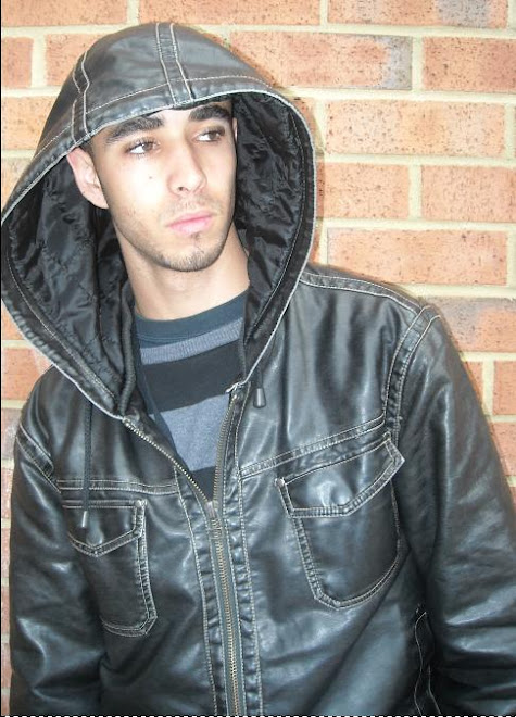
The mode of address that the magazine is using is the two leads of the band “faithless” leaning against a wall, with the female artist leaning against the male in a very sexual and somewhat dominating manner. This is a very thought provoking image as it attracts the readers or the general public to look and possibly open the magazine.
This tells me that the magazine wants very close attention from its readers and uses images like this to draw in fans of the magazine and other members of the public to pickup a copy and buy it. So in my view more often the magazine will use a central image that is really going to catch people’s eye.
A famous dance music band called “faithless” is featured on the front cover of this issue of mixmag. They are on the cover because the anchorage text says that they have announced an official return to the dance music scene.
The anchorage text says “FAITHLESS…fast cars, madness and medieval history: the biggest band in dance music returns”. This implies the overall personality and style of the band are generally reckless with their music t also implies they are returning.
Various other groups and artist are featured in the magazine. The magazine represents them in the form of puffs to advertise to it’s readers of what other artists and groups will be featured within the magazine and draw the individuals to buy the magazine.
The title block seems to stand out a lot because of the colours being used such as the background image is very dark and the title block uses a very rich crimson colour to stand out. This title block tells me that the magazine wants to stand out from other magazines, attract a certain age group and audience and thrive to be different from other magazines.
The title of the magazine tells me that their readerships are going to be fans of dance music and be able to name various groups and artists, which will make them, want to buy this magazine because they have an interest for the articles and issues raised in the magazine.
The title of this magazine tells me that it features a very urban and popularity based style to attract the target audience and interact with its readers rather than just present articles and images.
The title of this magazine tells me that it has a very urban image and appeals to a younger generation for sales purposes. To uphold this image they feature artists and groups wearing urban styled clothing and feature events and festivals based on this image and sub genre of music
The puffs inside the magazine suggest that event and festival dates, new artist information, reviews on current albums on the market and exclusive interviews with various artists and groups. This tells me that the magazine expect a young audience that enjoy dance music and that get out to different clubs, bars and festivals a lot.
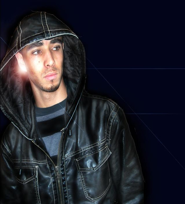
In this magazine they feature a grunge kind of image by using various colours such as red and black. For example the group featured on the cover are wearing glossy jackets and other items of clothing, the central image uses a black background which becomes brighter on one side of the image to make the group being photographed stand out more, also the title of the magazine uses a rich crimson to make the magazine as a whole stand out more. I think this is very attractive because of the way it has all been constructed to create a certain image. Also the colours used match with some of the fonts used such the anchorage text uses a grunge medieval type font which I think works really well
The strategies the magazine uses to attract its audience is featuring plenty of puffs to make the reader feel they will gain a lot of information if they buy this magazine also the more obvious method for this magazine would be to give away a free mix CD every issue this technique is also very useful because it makes the audience feel as if they are getting more for their moneys worth when they purchase this magazine

No comments:
Post a Comment