
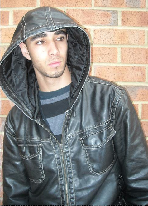
By looking at the front cover we can tell this is going to be a hip hop, RnB and soul music magazine. You can tell this because of the issues and articles that are present on the front cover such as the names and pictures of famous RnB singers and rappers.
The target audience for this magazine will more likely be young people aged 16-21. In particular they would either be hip hop or RnB fanatics or recognise the different artists named on the current issue of the magazine and understand the difference between hip hop and RnB.
The mode of address that the mag is using is Wyclef Jean performing on a guitar being kind of flamboyant and attracting attention to him-self and to a certain extent showing off to the readers of the magazine
The central image tells me that the magazine wants to engage its readers and be have a very informative relationship but yet present the idea that the artists featured in the magazine are true artists
The artist featured on the cover is Wyclef Jean, former lead singer of the famous Soul and RnB band, The Fugees. He is on the cover because he was formally retired but made a surprise performance and announced his return to the music industry
The anchorage text says “WYCLEF ROCKS” this implies that the artist is absolutely amazing at what he does.
The overall message that the artist is giving is that he can still perform well and that he still “ROCKS”.
Yes there are two groups featured on the magazine who are The Beastie Boys, and the Def squad. The magazine represents them as puffs which draw the individual to consider buying the magazine and also to show the readership who else is featured within the magazine
The title block is very large and stands out a lot due to the red background of the magazine and the white colour of the font. This tells me that the magazine likes to attract attention to it, make it noticed and draw the overall attention of the readership
The title of the magazine tells me that the readership may have a view that the music featured in the magazine provides a certain vibe and the title may attract a more mature audience because of its simplicity.
Also the title tells me that vibe magazine has a very soulful image but more predominately RnB due to the popularity of this sub genre of soul/blues music. It would also be fair to say through time the founder, Quincy Jones has shown the evolution from the blues, to soul, to rhythm and blues.
The title, “vibe” tells me that the magazine has a very close relationship to the music industry and styles out a hip hop style fashion to its readership.
The puffs tell me that the magazine expects to get a young or mature audience that are fans of the hip hop and RnB sub-genres for example one of the puffs mentioned was Big Pun & Fat Joe, iTwo tons of fun. This is a joke aimed at to very famous rappers, a joke that only hip hop fans would understand.
The magazine has used a red background which I believe is very effective because it is a very vibrant and attractive colour to use also it brings out the font colour that the magazine has used, white. The background seems to assist the very simple font colour and style and make nit look quite noticeable to its readers.
The strategy the magazine uses to attract the audience is featuring loads of puffs to make the reader feel that there going to find out a lot of information if they buy this magazine. Also the magazine uses a very abstract central image of an artist performing well to attract the readers to look straight at the front cover

No comments:
Post a Comment