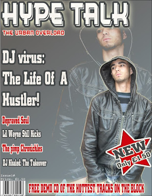
this is my first draft of my magazine cover which i constructed on photoshop.
I believe the pros of this magazine cover is that it looks quite professional and the colour scheme seems to work very well together. Also the page seems quite bold and is very easy to read, i also think that the central image is very eye catching draws alot of attention towards the magazine
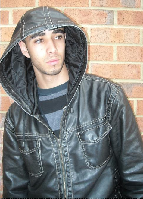
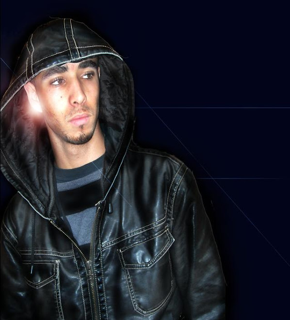
the cons of this page are that the background colour is quite dull and a way of improving this would be to pick a brighter colour next time to maybe uplift the page abit. Also the anchorage text does not match the central image very well for example the anchorage text says " dj virus: the life of a hustler" and the central image does not support the idea of a hustler more of an arrogant model featured in a fasion magazine. A way of improving this would be to choose a more suitable central image,


No comments:
Post a Comment