Friday, 1 May 2009
My Final Music Magazine Evaluation
Here is a comparison of my draft magazine cover and an edition of vibe magazines front cover, as you can see the anchorage text on my magazine is roughly positioned in the same position as Vibe Magazines, also how both central images are edited in roughly the same way for example both central images have a very simple and plain background, also how the puffs are positioned right under the anchorage text.
Here is a comparison of my final front cover and MixMag’s front cover, again as you can see the anchorage text is positioned on the left of the magazine, another thing that is similar is the use of two people in the central image which give this image some sort of provocative message to the audience in their own ways, also I decided to move the puffs to the right hand side of the magazine because I though the audience will read from left to right and once they have finished reading the anchorage text the eyes will continue to move in this motion and they will continue to read on.
Although I learnt a lot from analysing other existing magazines I then needed to give my magazine a certain edge to make it my own instead of a clone of existing magazines, by experimenting with Photoshop I managed to create my own unique style. For example if you look at the some of the text on both of my magazines you will notice that there is a consistent glow behind and around the text, also by playing with the type faces I managed to create a very unique font. If you pay attention to the font style on both my magazines you will notice that there is always a different outline colour, particularly the opposite colour of the actual font to attract the attention of the audience
Here is an example of how I made the font on my magazine look unique.
My music magazine represents quite a narrow range of social groups, I thought during my planning process that I would concentrate predominantly on an audience aged at around 16-20 that are interested in the music genres of Hip Hop, RnB and UK underground. The target audience that would read my magazine would be described as quite stylish, young and into street boy culture perhaps. I have represented these social groups in the way that the magazine looks quite cutting edge and quite dangerous, for example the anchorage text on my final front cover “ DK Productions and Depraved Soul: Its War” I believe the use of this anchorage text incorporates an element of danger and perhaps aggression, although that his magazine does not endorse any type of physical aggression which is ever growing amongst the age group I am targeting some may say that such anchorage texts and puffs that I have used in both my magazines do in fact endorse these conventions, for example “ DK Productions and Depraved Soul: Its War” and “DJ Virus: the Life of a Hustler” “ and “Lil Wayne still kicks ass”. On a more positive note I think that I have represented these social groups through the use of my images, for example if we look at my first draft of my front cover we can see that I took the central image using a mid long shot which originally was shot in front of a brick wall with faint graffiti on it, I believe that this was effective because I think some of my target audience may be used to seeing things like this in certain areas however I edited this and made the background a plain colour because I believe that the image was giving into negative stereo types made about young people, also if we look at the Mise-en scene of this image we notice that the person in the photo is wearing a baggy and very glossy jacket with his hood on, this costume is effective because it represents the current styles of young people of a street kind of culture. As mentioned before, the setting of the central image was in front of a brick wall with faint graffiti on it, although it did not get used I think the setting did represent my target audience although it was a negative representation. To your right is the original central image that I would have used.
I believe that my final front cover however, represents these social groups much better for example the central image is very provocative because of the way it is framed in terms of camera shots, I used a two shot of these two people back to back to support my anchorage text which featured war, I think this shot supports my anchorage text because it looks like there is some sort of rivalry and animosity between these two characters. Also in terms of Mise-en scene I thing that this image is again very effective in the representations of this social group, the first reason is the way that they are both dressed, I think that both characters look quite smart with one wearing a leather jacket and the other one wearing a black military styled jacket, with that in mind I also believe that they look quite thuggish aswell, almost like a cooperate thug. The setting of this photo is quite similar to the draft central image however this photo does not incorporate the graffiti in the background connoting negative stereo types.
To choose my target audience I firstly handed out a questionnaire asking in particular what age the recipients were, would genre of music they were into, whether they regularly bought music magazines and what other magazines they read. On the basis of my result for this questionnaire I was able to build a mental picture of what they would be, my target audience will be aged at around 16-20 more than likely to be students which affects the price of the magazine, they will be interested in Hip Hop, RnB and other underground forms of music. I also learnt that the location of the audience may affect the styles of music that they are involved in, that is why I my magazine is based around US and UK underground styles and people that follow these styles. I believe my target audience will be from very main stream areas such as London and other urban built up cities because I think that these people would be more interested in reading about the artists and articles featured in this magazine.
Once I had chose my target audience I had to somehow come up with a range of ideas on how to attract their attention or address this audience as effectively as I could. I thought that the more obvious way to do this was through language, for example one of the puffs says “Free demo CD of the hottest tracks on the block” I believe that the use of informal language and colloquialisms allowed me to engage into the street boy kind of culture another example of this is used in another puff “Lil Wayne still kicks ass” . Also the age group that I am trying to attract, 16-20 year olds I think would be very interested in freebies so that they get more for their money when purchasing magazines so I used freebies in my magazine to attract their attention, e.g. “Free demo CD of the hottest tracks on the block”. Whilst analysing other music magazines I noticed that they use a lot of big star’s names as puffs, and I also noticed that they are in fact quite effective, so on my magazine I thought of using big names that are involved in the type of scene and stardom that my target audience are interested in, for example I mentioned of the biggest names in the hip hop world currently in my magazine, Lil Wayne. I used this name because from my own experiences with this type of genre Lil Wayne’s name is very universal and seems to stand out wherever it is used amongst the hip hop and rnb fans. Another convention used in attracting my target audience was the slogan of the magazine, “The Urban Overload” . I think this was effective because my target audience will have a very urban style about them and it may lead them to believe that this magazine reflects their style and possible personalities. Also in terms of the age group my target audience will be, it is more than likely they may be still involved in education, if this is the case the question of budgeting themselves when buying magazines may be a problem, so to make this magazine more appealing in terms of price I set a very low price and placed it on the page in a two set coloured star so that it would attract plenty of attention. As mentioned before the use of big stars used on the front cover was very effective because whilst in my research process I found out that in my questionnaire what my audience would like to read about which included celebrity interviews and film and music reviews
The Media institution I think would be the most suitable to distribute and advertise my magazine would be IPC Media because of the amount of very popular and successful magazines they have distributed over the years, such magazines include Nuts, Loaded and the TV Times. I think that this media institution would be suitable because of the sheer volume of audiences they advertise and distribute their magazines to. I also think that media institution could help advertise my magazine because they may already have other platforms for example TV channels radio stations, websites ECT. I think that Kiss 100 would be another suitable media institution for advertising purposes because they heavily endorse the Hip Hop and RnB genres through the digital TV Channel, Their world famous radio station and their impressive website, and distributing my magazine through their platforms would benefit my magazine and their own business as they currently do not have a magazine.
Through out this project I have been introduced to many different conventions and variations whilst creating my magazine. To create my magazine I had to use a program called Adobe Photoshop, over the time I have developed several skills which enabled me to create my magazine. Such skills are the ability to edit the lighting of a photo, the ability to apply several images onto one layered background, the ability to edit font styles including adding different colours and lighting effects and how to replace colours on images. Another technological skill I have developed was creating a blog, I created my blog on Blogspot.com and upon creating the blog I have learnt how to upload various types of work e.g images videos and text based responses, I have also learnt how to create polls which allowed me to get feedback on my work from other blog users in my college network .Aswell as developing my technological skills I have also learnt how to critically analyse magazines and images to a point where I had a valid insight into the how the magazine industry works ie time/cost/effort, this involves finding the right artists and making an article for them, the photo shoots, choosing the location of the photo shoot and choosing what goes into the magazine itself.
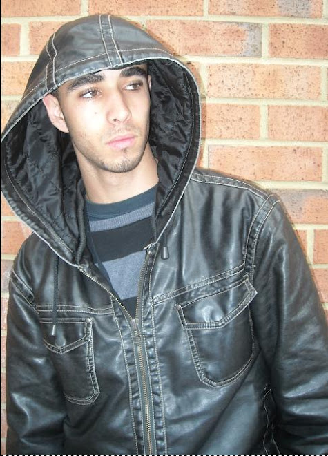
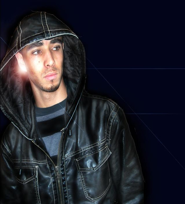
Above is a comparison to an image which I used for my contents page and how I edited this photo to make it look more effective and match the colour scheme of my contents page. I edited the image by removing the brick wall background and turning the brown leather jacket to black leather, I also added a glow on the characters ear to give the illusion he is wearing a very shiny earring which is hitting off the sunlight. to make him look more gruff and thuggish I darkened his beard so he does not look so young and innocent.
From comparing my preliminary task to my final cover, contents and double page spread, I think I have learned a great deal on how music magazines are constructed. When I created my preliminary magazine cover I did not have the knowledge of how camera shots affected my work and how they can show different things to my audience or how location affected the representations of the photo, I have also learnt from my preliminary task that the front cover should stand out amongst all other magazines and that maintaining the audiences’ attention is very important i.e. the use of puffs and buzz words. When I created my preliminary contents page I was not aware of how contents pages in magazines were constructed i.e. the layout of the page, where to position images and logos, but by analysing other magazines I began to realise how this was done and I have benefited heavily from this which reflects in my work. I have also learnt from my preliminary double page spread how language can affect the audiences’ attention, for example in my final double page spread I have an interview where I do use some very informal language including colloquialisms and swear words. I believe that this is effective because to it enables me to engage with my audience and let them know that this magazine is for them and will encourage them to buy it in the near future over a magazine that does not even represent them.


